
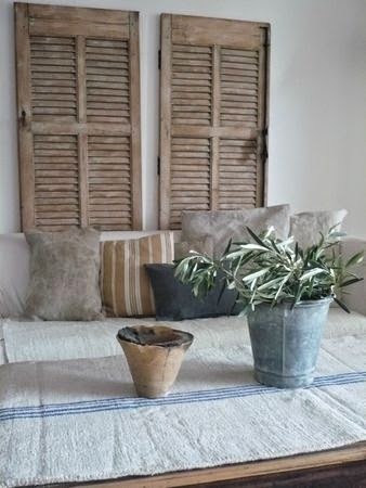
As much as I love and appreciate colour, my default position always tends towards neutrals. I find them tranquil and soothing and easy to live with. They are also easy to decorate with because they all blend so beautifully. They don't shout at you, they don't compete for attention, they all just get along in harmony. Now, if only my kids could behave like that!
Here are some pictures for you to enjoy....


.JPG)


Wishing you all a happy week ahead. I will be spending some contemplating O is for.....
Till next time
Sharon x
Image source: 6. L'Ambience, France 9. Veranda 13 Pam Pierce, 16 Via LL Interiors 17. Via Stinemos Blog 18. Via Trouvais 22 Via Linen and Lavender, 23 Velvet and Linen All other images via Tumblr and Pinterest


0 comments: