
The Pantone colours of the year for 2016 are Rose Quartz and Serenity. For those of us with more pedestrian attitudes to colour - that means pink and blue. I’m sure you already knew this, but perhaps your mind is occupied with higher things. My mind, on the other hand, is generally occupied with all things flippant and frivolous. Which is why I was wondering how Pantone come up with their selection. They definitely didn’t ask me! Maybe they asked you?

Pinterest have also come up with décor colours of the year - grey and mauve. I think that might be more representative of the what people like. After all they base it on the things that people pin – people like you and me. I think grey is the most useful and versatile colour to use in decorating. But that just me – and as I already said, Pantone didn’t ask me.


So back to pink and blue. I’m not entirely sure about this combination – it makes me think of babies and nurseries. Not that I don’t like thinking about babies and nurseries. There are a some happy memories associated with those days, although most of the memories are about lack of sleep and leaky body parts! My question is, are pink and blue indicative of decorating in today’s world, Have we not somehow evolved beyond that? Don’t get me wrong, I like pink and I like blue, I’m just not sure I like them together that much. Maybe Pantone didn’t necessarily mean them to be used together.

Apparently these colours were chosen because they psychologically fulfill our yearning for reassurance and security. According to Pantone; "Rose Quartz is a persuasive yet gentle tone that conveys compassion and a sense of composure. Serenity is weightless and airy, like the expanse of the blue sky above us, bringing feelings of respite and relaxation even in turbulent times." Well, who can argue with that!


I don't know about you, but I am waiting with bated breath to see what they come up with for 2017. I wonder if they will ask me?
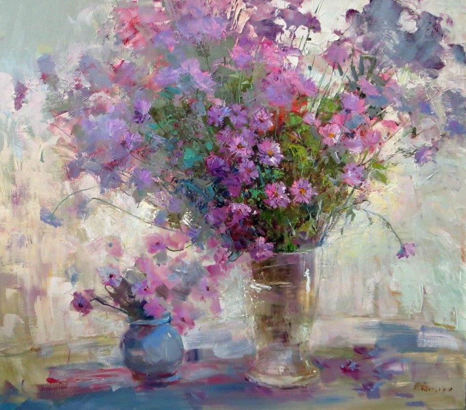 |
| Russian Artist Irina Chipenko |
Breaking News:
FLASH SALE - savings of up to 25%
It's the weekend and to kick it off, NetDecor are having a FLASH SALE on some of their stunning and unique glassware while stocks last!
BUY NOW on www.netdecor.co.za
Till next time
Sharon x


