You have probably all seen the issue of Veranda featuring Pam Pierce's redesign of her home. I have been corresponding via email with a reader on the subject who though it might be a good idea for a post. The reader in question was somewhat disappointed with Pam's new direction and I am going to stick my neck out here, and have to say, I agree with her. While Pam's design skills and talent are certainly not in question, and I can understand that she wants to progress in a different direction, her new style is not entirely to my taste! Up until now I have been completely smitten with most of her interiors, but the contemporary elements included in her new design are just not my cup of tea!
While I can appreciate the Eames chair and ottoman as a design classic, it is not a piece of furniture that I would want in my home. Some of you are probably horrified?
I personally find this dining room table and chairs too stark and contemporary - better suited to a boardroom than a dining room, imho.
I loved this previous incarnation of her dining room.
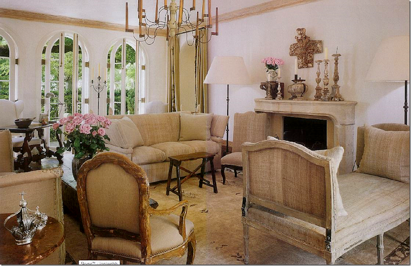
While I don't mind this new version on her living room too much ... I so much prefer the previous versions below! (Not a big fan of the Wiggle chair.)
The tulip table - also not for me, I'm afraid. I do like the addition of the interiors shutters, which don't seem to be in the previous interior below and that fireplace still remains one of my favourites ever!
I love everything in this previous version of this room, except the tulip table.
Her new kitchen! The island leaves me cold, I have to say. It might be more at home in a restaurant kitchen. I'm pleased to see that she has kept the worn wooden beam and some of the warmer accessories like the old bread boards and cow head (or is it a bull?)
I was completely enamored with her kitchen when it looked like this!
Here, the lovely folding shutters have been removed and those beautiful wooden cupboard doors painted and given new handles, but this island is much prettier than her latest one.
I like her new bedroom, although I think curtains would make it a but warmer. I like the bed, love the chair and the chest of drawers next to the bed. I couldn't find a picture of her bedroom in it's past life so don't know what changes were made.
I also couldn't find a picture of her guest bathroom so I don't know what changed here either. I don't mind this one, although it is a little too "all - white" for my taste.
Finally, her guest room - this is gorgeous - I wouldn't change a thing! I wonder if she would have me to stay ............ probably not after reading this post :)
I think I would still happily have Pam travel across to South Africa to redecorate my home, but I would insist she reverts to more of her old style and the Wiggle chair, Eames Chair and tulip table can all stay behind.
I would love to hear your views.
Till next time
Sharon x
Image source: Veranda Magazine, Pam Pierce, Cote de Texas.


